


Does Green on COVID-19 Maps Mean What You Think?

Picture a traffic light.
This isn’t a trick question. We want you to visualize some sort of box housing three lightbulbs, each behind a colored filter: red on top, yellow in the middle, green on the bottom.
What does it mean? This isn’t a trick question either—not yet.
The red bulb means stop. The yellow bulb means slow down. And the green bulb means it’s safe to go. How fast you drive still depends on some combination of local norms, how far away you are, and your risk tolerance—but the overall framework is the same most places you go.
This should all feel intuitive and transparent so far.
But it’s not. You had to learn it.
It wasn’t hard to learn. There is almost perfect consensus around what traffic lights signify, and that means you don’t spend a lot of time or conscious processing power figuring out the meaning of every traffic light you see.
If you’re not convinced, imagine a town that uses the same type of traffic light: same metal box, same three bulbs, same colored filters. But this town has put in place its own communication scheme. Red means there’s heavy traffic today. Yellow means watch for speed traps. And green means school children may be crossing the road. These are all useful things for a driver to know—but what would happen if you came to town without knowing about this different system? If multiple lights were on at once, at least you’d have a fighting chance at realizing this traffic light worked differently. But if you just saw a green light, you might end up running over a child.
One key idea from linguistic anthropology is that most communication relies on just this sort of consensus. From public signage to the value of money to the meanings of words, shared symbolic systems only work if all members of a society agree on them. Sometimes, that agreement becomes so second nature to us that we forget it’s just convention.
But it takes work to arrive at consensus over the meaning of signs, and the process is contested along the way. That’s happening right now with visual representations of COVID-19’s spread.
Charts, maps, and graphs comparing case numbers across space and time have become a ubiquitous part of how the U.S. public assesses the current risks surrounding the coronavirus. Yet, these visualizations can also be arbitrary or misleading.
A case in point: The U.S. Centers for Disease Control and Prevention (CDC) recently shifted their approach to assessing and visualizing COVID-19 risks. On February 25, when they released COVID-19 maps using these new metrics, large swaths of the U.S. suddenly went from living in red regions (signaling “high” transmission risk) to green or yellow regions (signaling “low” or “moderate” community levels). This change left many people feeling disoriented.
As linguistic anthropologists, we can help explain why these changes feel so unsettling. We look at why some data visualizations are more illuminating than others—and what ever-changing norms can teach us about our struggle to get a handle on the pandemic.
There’s some good news about COVID-19–related visualizations: There is an emerging consensus around what kinds of comparative data to use and how to display them visually.
The bad news: Whether by malice, incompetence, or good-faith differences of opinion, there are still heaps of charts, graphs, and maps that don’t follow it.
Let’s start with the good news. We’ve seen convergence around the following guidelines, all of which help make comparisons more meaningful:
1. Cases should be reported on a population-adjusted basis.
Early in the pandemic, many news organizations were reporting absolute case numbers rather than case rates. But 200 new COVID-19 cases in a town of 1,000 is very different than 200 new COVID-19 cases in New York City (population > 8 million). Now we’re seeing per-capita numbers, which allow us to compare states or counties of different sizes.
2. Cases should be reported on a rolling weekly basis.
Early in the pandemic, many news organizations were reporting daily numbers. But a single-day fluctuation can be due to dozens of factors—laboratory staffing patterns, for instance—that have nothing to do with the prevalence of COVID-19. We are now largely seeing rolling averages or rolling totals that can account for these temporal patterns.
3. Certain thresholds are meaningful and remain so over time.
Setting threshold values and holding them stable over time is what lets people compare today’s map to yesterday’s and make sense of them. If you’re not an epidemiologist, you might not care about the specific values—but you probably want to know how likely you are to get sick and what you can do to prevent that.
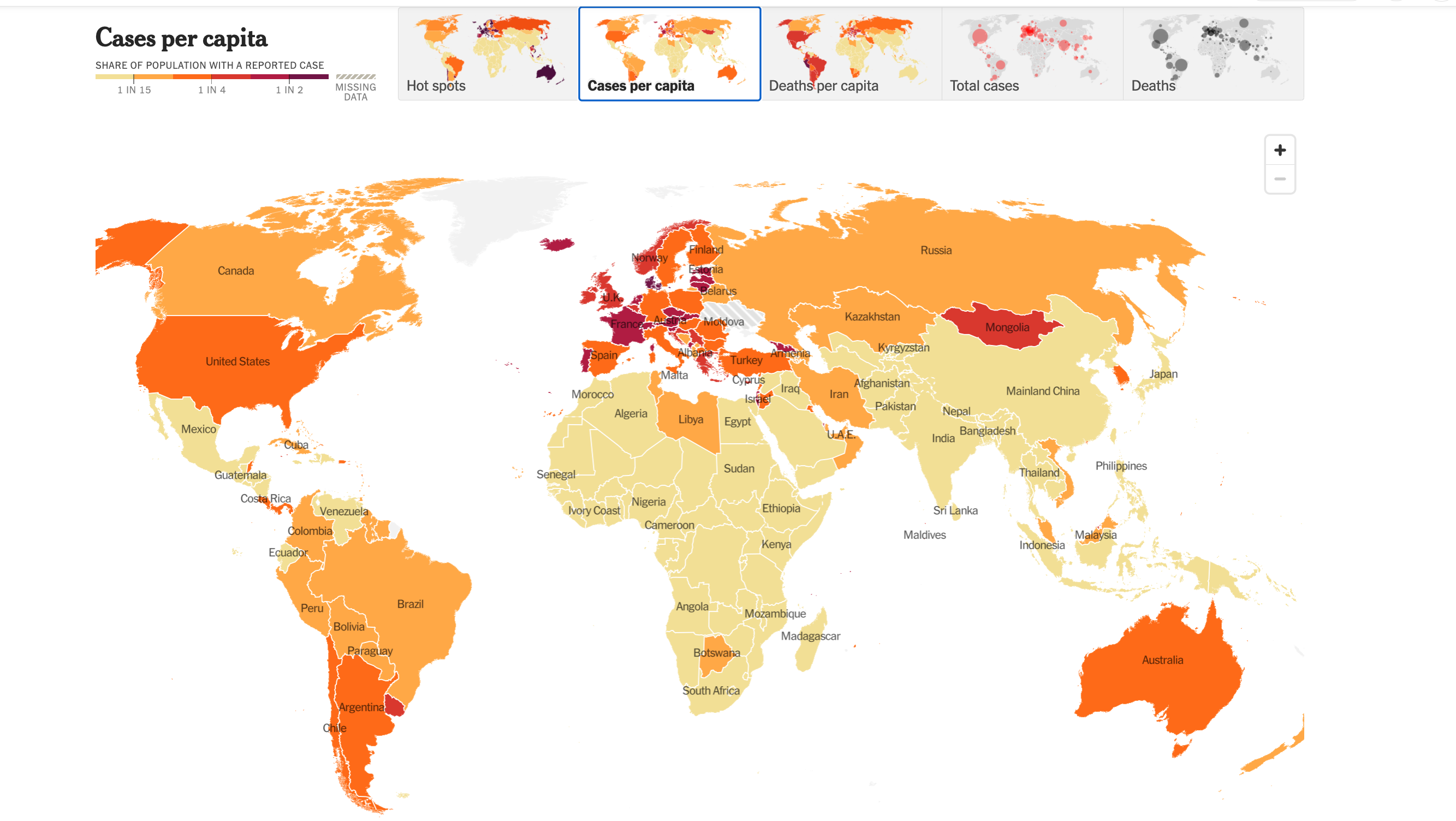
4. “Heat maps” are useful.
You’ve probably seen COVID-19 data represented on a color-coded “choropleth map,” more commonly called a heat map. These maps translate some statistical quantity into colors per some geographic unit, such as countries, U.S. states, counties, or census tracts. Each color represents a particular threshold of cases—and, crucially, the consensus mapping strategy now relies on the three principles above. The colors and threshold values vary, but everyone is speaking the same general language. Green, blue, and white tend to mean things are under control while yellow, orange, and red suggest increasing danger.
If you’re familiar with these principles, you probably won’t have a hard time reading this map.
And now for the bad news.
Because our understanding of maps is based on established conventions, it can be hard to make sense of them when they suddenly look different.
With the recent CDC changes, the United States’ approach to mapping is at an inflection point. Instead of stable thresholds for community transmission based on per-capita case rates and percentages of tests that come back positive (which had been the key metrics since July 2021), the CDC has shifted to something called “community level,” which emphasizes health care burden over caseloads.
Before the change, red (“high” community transmission) represented regions on a map with more than 100 weekly cases per 100,000 population. Blue (“low” community transmission) represented regions with less than 10 cases among this many people.
After the change, many red counties became orange, yellow, or green (respectively, “high,” “medium,” or “low” community level) overnight. Green regions on the map could now have up to 199 weekly cases per 100,000 people. That’s twice the old threshold for high community transmission—and 20 times the old threshold for low!
And, importantly, the recommendations of what to do changed at the same time. Newly orange counties—the ones with a higher community level—now require a lower level of base preventive measures than previously blue ones.
Unsurprisingly, this shift would leave people used to the former style of COVID-19 maps confused, to say the least.
We can’t know the intentions of the CDC’s map creators, but as anthropologists, that isn’t the question we’re asking. Instead, we judge a map’s impacts by the responses it elicits. And public health scholar after public health scholar responded with concerns and questions about what this change meant. The president of the American Medical Association pledged to continue following the stricter prior guidelines around masking and encouraged others to do the same. Medical anthropologist Martha Lincoln described the changes as “an incredible abnegation of responsibility.”
There’s no natural law that requires a red light to mean stop or a red region on a map to indicate danger—but on the CDC maps, when red disappeared entirely and many previously red regions suddenly became green and yellow, the green areas felt like they should be “safe,” whatever the fine print might say.
That’s what raised the hackles of some public health and medical experts. Doing what feels safe often does not lead to sound public health policy that would keep people safe.
In short: Any system of data visualization could work if readers know how to interpret it. But once a certain style of visualization has become standardized for reporting COVID-19 case numbers, people will assume that each new representation is meant to be read according to those standards.
One that doesn’t is bound to mislead.
The new CDC maps illustrate a fundamental point that was made decades ago by the sociologist Harold Garfinkel: Society operates on a complex system of rules, but these rules are often so subtle and taken-for-granted that we can only recognize them through the surprise and disorientation that result from their being broken.
Faced with the new maps, some epidemiologists reacted like Garfinkel’s research participants did in a study where he erased an X from a tic-tac-toe game and repositioned it elsewhere on the board: That’s not how this works!
The key implication for our purposes is that the color scheme used for mapping COVID-19 is a social fact, not a scientific one. It depends on widespread public consensus in order for it to make sense. However, even prior to the new CDC guidelines, the U.S. public was struggling to come to a consensus over how to measure and visualize COVID-19 risk.
Like the ongoing debates over COVID-19 vaccines and masking, these counter-visualizations reveal deep fissures in public understandings of disease transmission and risk. They even seem to question the possibility of “public understanding” altogether.
Science studies scholar Crystal Lee and her colleagues have described the use of visualizations by coronavirus skeptics who opposed then-current public health measures in the U.S. These “counter-visualizations,” which “[use] orthodox methods to make unorthodox arguments,” are evidence of a fundamental epistemological conflict. The “anti-maskers” who created them recognized that science is a process of continual testing and verification; they knew how to work with data and followed all best practices for visualization. And yet, they intentionally contradicted the very measures that public health authorities had come to recommend.
The new CDC heat maps feel—at least to some members of the public—like counter-visualizations. That’s because, like the charts and maps created by the anti-mask community, the introduction of “community level” in place of “community transmission” takes the same data and reanalyzes it to prompt different responses from its audience.
Ultimately, the disagreements about how to visualize and convey risk are disagreements about what it means to be safe. The new CDC guidelines increase the relative importance of hospital capacity compared to case rates, which suggests they no longer consider it dangerous simply to test positive as long as you don’t become seriously ill.
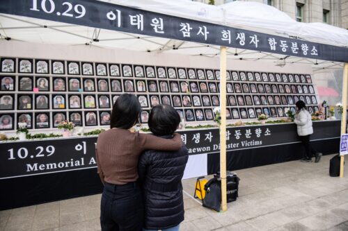
That definition of safety is hard for others to swallow—especially given concerns about long COVID, the disproportionate burdens that COVID-19 places on BIPOC communities, the lack of vaccines for children under the age of 5, and the serious health risks the virus continues to pose for people who are disabled, chronically ill, and/or immunocompromised.
In fact, throughout the coronavirus pandemic, it has been difficult to know where the danger is coming from. And the problem is not just the CDC’s changes to color codes.
Shared symbolic systems only work if all members of a society agree on them.
Heat maps claim to show us where, geographically, the danger lies. But the lines on a map can just as easily give viewers a false sense of security—or reify preexisting divisions across borders. As we see in the short history of the omicron variant—first detected in Botswana, Hong Kong, and South Africa in November 2021, but as researchers later demonstrated, already present in Europe at that time—a line on a map can never offer more than an illusion of safety. Yet countries all over the world initially banned travel to South Africa, continuing what anthropologist Adia Benton termed a “racialized geography of blame,” which has been happening since this novel coronavirus first appeared in late 2019.
In other words, one of the dangers of relying so heavily on maps to convey virus risk is that these visualizations fail to account for the constant movement of people across borders—exactly the wrong tactic for responding to a highly contagious global virus.
The bottom line is: A meaningful public response to the pandemic requires more than a common language for how to interpret and visualize data using maps. It also requires the public understanding and trust that underlie any shared symbolic system—the kind of understanding that lets you sail through a green light, trusting that other drivers will stop at red because their safety depends on yours.
Barchas-Lichtenstein’s contribution to this essay was written as part of Meaningful Math, a research project funded through National Science Foundation Award #DRL-1906802.

Daniel Ginsberg is the director of education and professional practice at the American Anthropological Association (AAA). They conduct research on anthropologists’ careers in academic, business, government, and nonprofit settings, as well as anthropology education at the graduate, undergraduate, and pre-university levels. Ginsberg also manages education and outreach activities, including Anthropology Day, the AAA’s webinar series, and the public education initiative World on the Move: 250,000 Years of Human Migration. Trained as a linguistic anthropologist of education, Ginsberg’s other interests include experiential and critical pedagogy, such as undergraduate research opportunities, nonformal education, and un-grading.

Jena Barchas-Lichtenstein leads media research and partnerships at the applied research think-tank Knology. They received their Ph.D. in anthropology from the University of California, Los Angeles, in 2013. They currently partner closely with news organizations to support the critical work of journalism in informing the public. They are co-principal investigator of Meaningful Math, a four-year National Science Foundation–funded project to help support public quantitative reasoning through journalism.
